


 |
 |

1. Variables
and Relationships
First, let's look
at a definition of a graph provided by some of the leading writers in
Canadian introductory economics. Miller et al. define a graph as "a
visual representation of the relationship between variables."1 This
definition emphasizes the importance of two aspects of graphs crucial
to your understanding of what they do, which are variables and relationships.
A relationship is
established in graphs between or among variables. Variables are quantities
of data that change, and from which we want to establish trends. Variables
are either independent or dependent. Variables and relationships in
economics include the price of a good or service in relation to quantity
demanded or supplied of a good or service, annual consumption expenditure
in relation to annual real GDP, the Canadian interest rate in relation
to annual planned expenditures of consumers, business, and government.
We need to establish the differentiation between independent and dependent
variables. For example, in social research, you may want to establish
a relationship between height and weight. You could show that the weight
of an individual is the dependent variable, dependent on the height
of an individual, and height is an independent variable. More height
is going to mean, ceteris paribus (other things being equal), greater
weight. Less height is likely going to mean a lower weight. A dependent
variable changes in relation to an independent variable, while an independent
variable changes, for purposes of analysis, freely in value.
A relationship could
be thought of as a connection; you connect two variables to establish
an association. There are two relationships you need to know about in
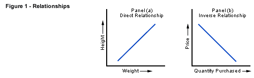
economics. A positive or direct relationship is one in which the two
variables (we will generally call them x and y) move together, that
is, they either increase or decrease together. An excellent example
is the price of steel, and the response of steel suppliers to bring
steel to the market; as the price increases, so does the willingness
of producers to bring more of the good to the market. The example we
gave of the relationship between height and weight is a direct or positive
relationship.
In a negative or
indirect relationship, the two variables move in opposite directions,
that is, as one increases, the other decreases. Consider the price of
coffee and the demand for the good. As the price of coffee, for example,
goes to higher and higher levels, we can predict that people will substitute
tea or hot chocolate for it, and buy less. As the price of coffee declines,
people will buy more and more of it, and quite possibly buy more than
they would regularly buy, and store or accumulate it for future consumption,
or to sell it to others. This relationship is negative or indirect,
that is, as the price variable (typically, in economics, the y variable)
increases, the quantity variable (typically, the x variable) decreases;
and, as the price variable decreases, the quantity demanded increases.
These relationships
between positivly- and negatively-related variables are demonstrated in
the graphs (Figure 1) which follow, positive first and negative second:
What is the value
of graphs in the study of economics? Graphs are a very powerful visual
representation of the relationship between or among variables. They
assist learners in grasping fairly quickly key economic relationships.
Years of statistical analysis have gone into the small graph you can
examine to learn about key forces and trends in the economy. Further,
they help your instructor to present data in a way which is small-scale
or economical, and establish a relationship, frequently historical,
between variables in a certain kind of relationship. They permit learners
and instructors to establish quickly the peaks and valleys in data,
to establish a trend line, and to discuss the impact of historical events
such as policies on the data that we wish to analyze.
2. Types of Graphs
in Economics
There are various
kinds of graphs used in business and economics that illustrate data.
These include pie charts (segments are displayed as portions, usually
percentages, of a circle), scatter diagrams (points are connected to
establish a trend), bar graphs (results for each year can be displayed
as an upward or downward bar), and cross section graphs (segments of
data can be displayed horizontally). You will deal with some of these
in economics, but you will be dealing principally with graphs of the
following variety.
Certain graphs display
data on one variable over a certain period of time. For example, we
may want to know how the inflation rate has varied in the Canadian economy
from 1990-1999. We would choose an appropriate scale for the rate of
inflation on the y (vertical) axis; and on the x
(horizontal) axis show the ten years from 1990 to 1999 with 1990 on the
left, and 1999 on the right. We could show the inflation rate or percentage
changes to the Consumer Price Index (CPI) as a curve or line. We would
notice right away a trend. The trend in the inflation rate data is a
decline, actually from a high of 5.6% in 1991 to a low of 0.2% in 1994.
We would see that there has been some increase in the inflation rate
since its absolute low in 1994, but not anything like the 1991 high.
And, if we did such
graphs for each of the decades in Canada since 1960, we would see that
the 1990s were a unique decade in terms of inflation. No decade, except
the 1960s, shows any resemblance to the 1990s. We can then discuss the
trends meaningfully, since we have ideas about the data over a major
period of time. We can link the data with historical events such as
government anti-inflation policies, and try to establish some connections.
Other graphs are
used to present a relationship between two variables, or in some instances,
among more than two variables. Consider the relationship between price
of a good or service and quantity demanded. The two variables move in
opposite directions, and therefore demonstrate a negative or indirect
relationship. Aggregate demand, the relationship between the total quantity
of goods and services demanded in the entire economy, and the price
level, also exhibits this inverse or negative relationship. If the price
level (based on the prices of a given base year) rises, real GDP shrinks;
while if the price level falls, real GDP increases.
Further, the supply
curve for many goods and services exhibits a positive or direct relationship.
The supply curve shows that when prices are high, producers or service
providers are prepared to provide more goods or services to the market;
and when prices are low, service providers and producers are interested
in providing fewer goods or services to the market. The aggregate expenditure,
or supply, curve for the entire Canadian economy (the sum of consumption,
investment, government expenditure and the calculation of exports minus
imports) also shows this positive or direct relationship. Aggregate
planned expenditure increases as real GDP increases, and decreases as
real GDP diminishes.
3. Construction
of a Graph
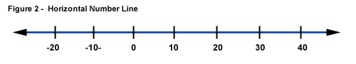
You will at times
be asked to construct a graph, most likely on tests and exams. You should
always give close attention to creating an origin, the point 0, at which
the axes start. Label the axes or number lines properly, so that the
reader knows what you are trying to measure. Most of the graphs used
in economics have, a horizontal number line or x-axis, with negative
numbers on the left of the point of origin or 0, and positive numbers
on the right of the origin. Figure 2 presents a typical horizontal number
line or x-axis.
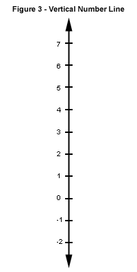
In economics graphs,
you will also find a vertical number line or y-axis. Here
numbers above the point of origin (0) will have a positive value; while
numbers below 0 will have a negative value. Figure 3 demonstrates a typical
vertical number line or y-axis.
When constructing a graph, be careful
in developing your scale, the difference between the numbers on the
axes, and the relative numbers on each axis. The scale needs to be graduated
or drawn properly on both axes, meaning that the distance between units
has to be identical on both, though the numbers represented on the lines
may vary. You may want to use single digits, for example, on the y-axis,
while using hundreds of billions on the x-axis. Using a misleading scale by squeezing or stretching the scale
unfairly, rather than creating identical distances for spaces along
the axes, and using a successive series of numbers will create an erroneous
impression of relationship for your reader.
If you are asked
to construct graphs, and to show a knowledge of graphing
by choosing variables yourself, choose carefully what you decide to
study. Here is a good example of a difficulty to avoid. Could you, for
example, show a graphical relationship between good looks and high intelligence?
I don't think so. First of all, you would
have a tough time quantifying good looks (though some social science
researchers have tried!). Intelligence is even harder to quantify, especially
given the possible cultural bias to most of our exams and tests. Finally,
I doubt if you could ever find a connection between the two variables;
there may not be any. Choose variables that are quantifiable. Height
and weight, caloric intake and weight, weight and blood pressure, are
excellent personal examples. The supply and demand for oil in Canada,
the Canadian interest rate and planned aggregate expenditure, and the Canadian
inflation rate during the past forty years are all quantifiable economic
variables.
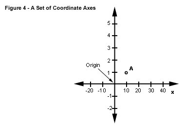
You also need
to understand how to plot sets of coordinate points on the plane of
the graph in order to show relationships between two variables. One
set of coordinates specify a point on the plane of a graph which is the space
above the x-axis, and to the right of the y-axis. For example, when
we put together the x and y axes with a common origin, we have a series
of x,y values for any set of data which can be plotted by a line which
connects the coordinate points (all the x,y points) on the plane.
Figure 4 below shows
an x- and y-axis, an origin, and a paired observation of the variables,
a coordinate point on the plane of the graph at x = 10, and y = 1. Such
a point can be expressed inside brackets with x first and y second,
or (10,1). A set of such paired observation points on a line or curve
which slopes from the lower left of the plane to the upper right would
be a positive, direct relationship. A set of paired observation or coordinate
points on a line that slopes from the upper left of the plane to the
lower right is a negative or indirect relationship.
4. Working from
a Table to a Graph
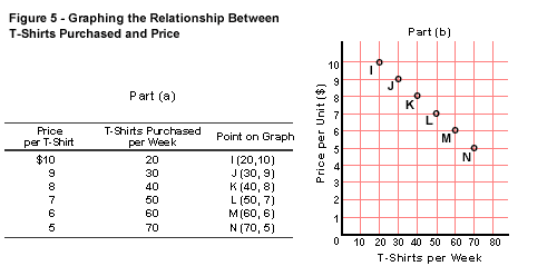
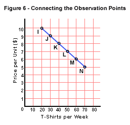
Figures 5 and 6
present us with a table, or a list of related numbers, for two variables,
the price of a T-shirt, and the quantity purchased per week in a store.
Note the series of paired observation points I through N, which specify
the quantity demanded (x-axis, reflecting the second column of data)
in relation to the price (y-axis, reflecting first column of data).
See that by plotting each of the paired observation points I through
N, and then connecting them with a line or curve, we have
a downward sloping line from upper left of the plane to the lower right,
a negative or inverse relationship. We have now illustrated
that as price declines, the number of T-shirts demanded or sought increases.
Or, we could say reading from the bottom, as the price of T-shirts increases,
the quantity demanded decreases. We have stated here, and illustrated
graphically, the Law of Demand in economics.
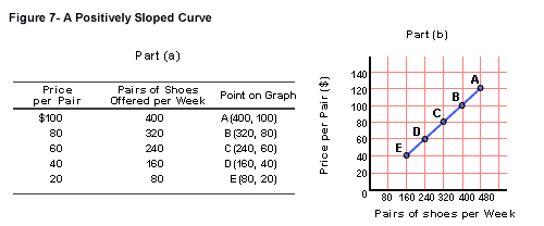
Now we can turn
to the Law of Supply. The positive relationship of supply is aptly illustrated
in the table and graph of Figure 7. Note from the first two columns
of the table that as the price of shoes increases, shoe producers are
prepared to provide more and more goods to this market. The converse
also applies, as the price that consumers are willing to pay for a pair
of shoes declines, the less interested are shoe producers in providing
shoes to this market. The x,y points are specified as A through to E.
When the five points are transferred to the graph, we have a curve that
slopes from the lower left of the plane to the upper right. We have
illustrated that supply involves a positive relationship between price
and quantity supplied, and we have elaborated the Law of Supply.
Now, you should
have a good grasp of the fundamental graphing operations necessary to
understand the basics of microeconomics, and certain topics in macroeconomics.
Many other macroeconomics variables can be expressed in graph form such
as the price level and real GDP demanded, average wage rates and real
GDP, inflation rates and real GDP, and the price of oil and the demand for,
or supply of, the product. Don't worry if at first you don't understand
a graph when you look at it in your text; some involve more complicated
relationships. You will understand a relationship more fully when you
study the tabular data that often accompanies the graph (as shown in
Figures 5 and 7), or the material in which the author elaborates on
the variables and relationships being studied.
5. Steep vs.
Gentle Slopes
When you have been
out running or jogging, have you ever tried, at your starting pace,
to run up a steep hill? If so, you will have a good intuitive grasp
of the meaning of a slope of a line. You probably noticed your lungs
starting to work much harder to provide you with extra oxygen for the
blood. If you stopped to take your pulse, you would have found that
your heart is pumping blood far faster through the body, probably at
least twice as fast as your regular, resting rate. The greater the steepness
of the slope, the greater the sensitivity and reaction of your body's
heart and lungs to the extra work.
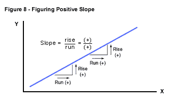
Slope has a lot
to do with the sensitivity of variables to each other, since slope measures
the response of one variable when there is a change in the other. The
slope of a line is measured by units of rise on the vertical y-axis
over units of run on the horizontal x-axis. A typical slope calculation
is needed if you want to measure the reaction of consumers or producers
to a change in the price of a product.
For example, let's
look at what happens in Figure 7 when we move from points E to D, and
then from points B to A. The rise or vertical movement from E to D is
20, calculated by 40 - 20 = 20. The run or horizontal movement is 80,
calculated from the difference between 160 and 80, which is 80. The
slope = run / rise is therefore, 20 / 80, which is ¼, or 0.25. Let's
look at the change between B and A. The vertical difference is again
20 (100 - 80), while the horizontal difference is 80 (400 - 320). So, the
slope is, again, ¼, or 0.25. We can generalize to say that where the
curve is a straight line, the slope will be a constant at all points
on the curve. Figure 8 shows that where right-angled triangles are drawn
to the curve, the slopes are all constant, and positive.
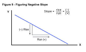
Now, let's take
a look at Figure 9, which shows the curve of a negative relationship.
All slopes in a negative relationship have a negative value. If we look,
for example, at the change between points I and J in Figure 6, we find
a -1 rise (9 - 10 = -1), and a +10 run (30 - 20 = 10). The slope on
this negative relationship curve is, therefore, -1/10 or -0.1.
We can generalize to say that for negative relationships, increases
in one variable are associated with decreases in the other, and slope
calculations will, therefore, be of a negative value.
A final word on
non-linear slopes. Not all positive nor negative curves are straight
lines, and some curves are parabolic, that is, they take the shape of
a U or an inverted U, as is demonstrated in Figure 10, shown below.
To the left of point C, called the maxima, slopes are positive, and, to the
right of point C, they are negative. You can determine the slope of a parabola by drawing
a tangent (touches at a single point) line to any point on the curve.
You can see below that a point such as R is then selected on the line,
and a right angled triangle can be constructed which joins points R
and B. We can then calculate the rise over the run between points B
and R from the distance of the height and the base of the triangle.
So, we can generalize to say that the slopes of a non-linear line are
not constant like a straight line and will vary in sign and in value.

You will find that
a knowledge of slope calculations enhances your understanding of the
dynamics of graphs. It will likely improve your marks in economics,
since many test questions require you to illustrate your thinking with
graphs.
Summary
A person from an
Eastern culture once observed, "A picture is worth a thousand words."
So are graphs. Without them, we would be forced to examine thousands,
or tens of thousands, of bits of statistical information to determine
economic relationships. Many economic researchers over the years have
done that work for you, and it gets expressed in nice little packages
called graphs. They convey information easily, efficiently, and effectively,
and can stimulate good thought and discussion.
Notes
1.
R. L. Miller, B. Abbott, S. Fefferman, R. K. Kessler, and T. Sulyma, Economics Today: The Micro View, Second Canadian Edition.
(Toronto: Pearson Education Canada, 2002), p. 40.
|